More functionality, less friction - how we're updating Qapital's look and feel
●17 Mar, 2019
When we launched in 2015, our tagline was: Save Small. Live Large.® It summed us up perfectly so we used it on everything from our mugs to our mousepads. The tagline reflects the great things that can happen with a little effort. The approach has been transformative for our members. Today, they save an average of $3,000 a year, which is impressive given that four in ten adult Americans can’t come up with $400 in the event of an emergency.
But now, as well as saving with us, our members can invest with our personalized portfolios and they can spend with our checking account. In the past year we’ve introduced some of our most ambitious tools. Payday Divvy to help members budget more intelligently. Spending Sweet Spot to help members find a better balance between what they want now and what they’ll need in the future. And Money Missions, our fun challenges that help members build better money habits.
As exciting as it is to add new features, sometimes you need to take a step back and make sure the foundations are still solid. As the app evolved, we realized our design system needed to evolve with it. Our design team set about the task of reimagining a simpler, pared down look and feel with more focus on your Goals and greatly improved accessibility.
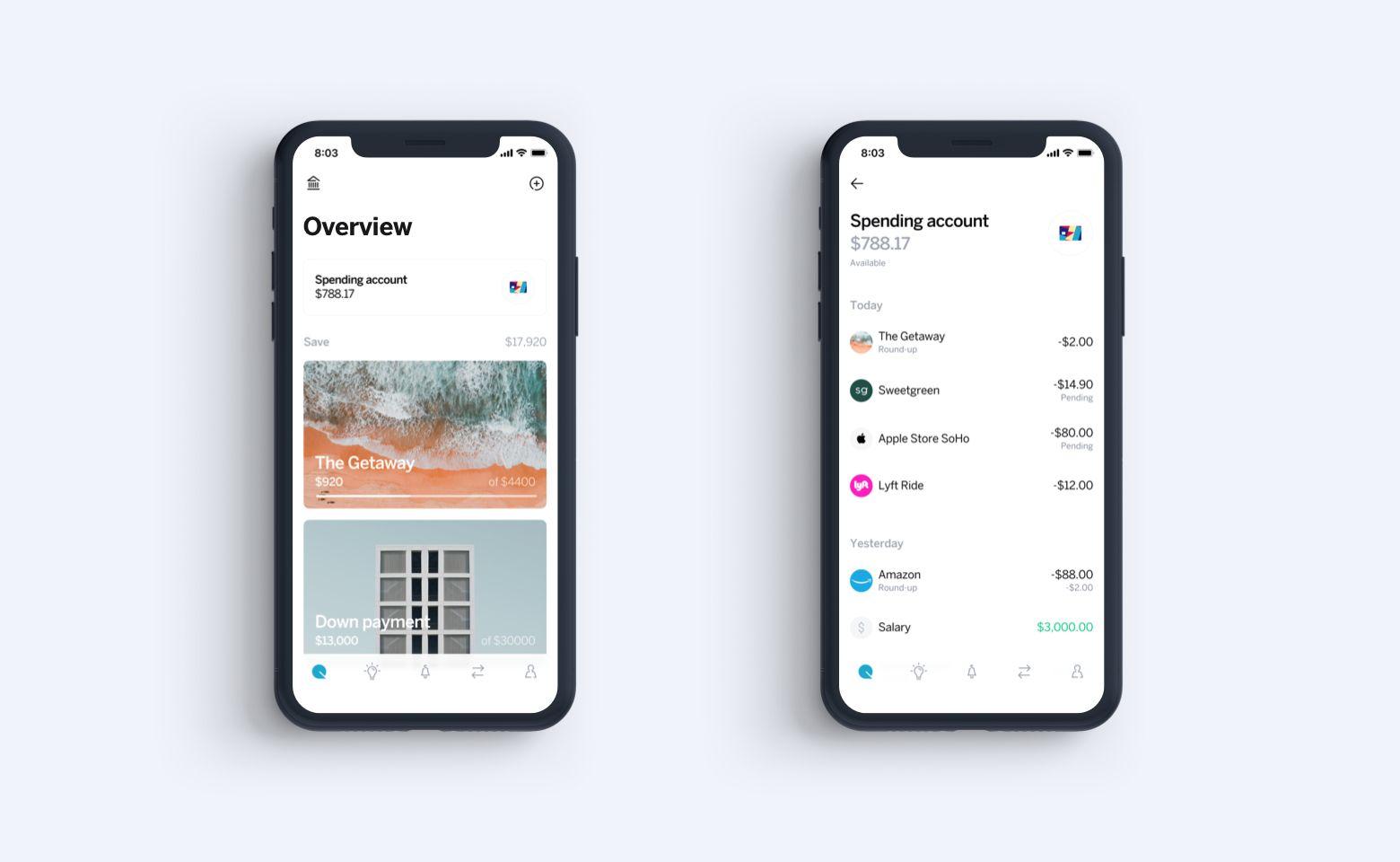
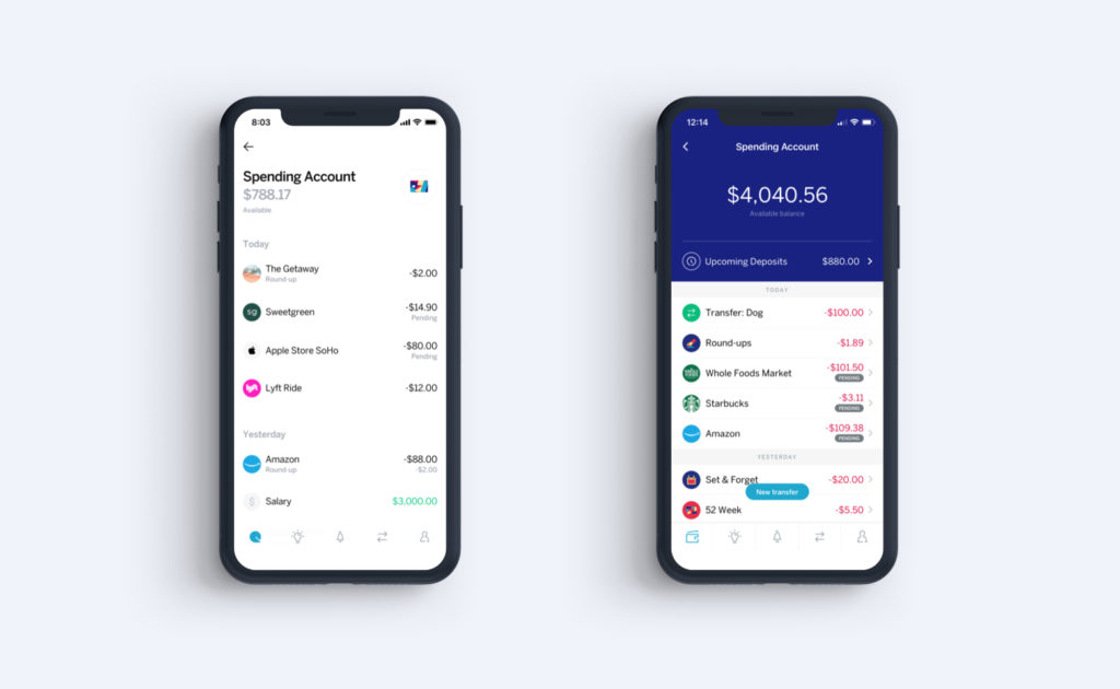 Our new Spending account view (left) with the previous version on the right. The reduced visual noise is a recurring theme throughout the updated design.
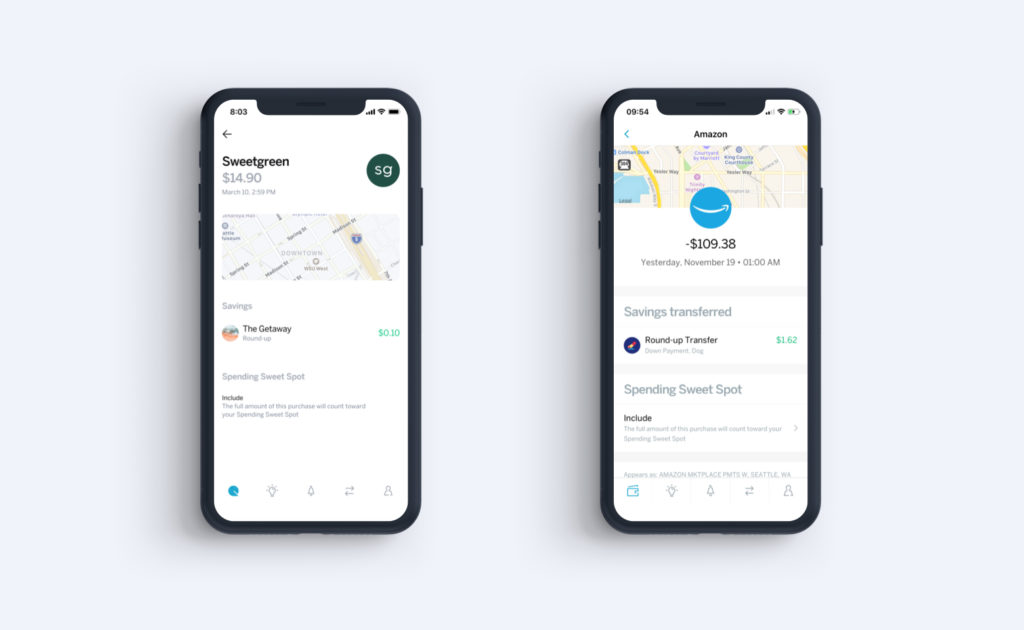 The updated transaction view on the left, with the old version on the right. We’ve implemented a modular system that can adapt to various merchant & transaction data.
You might have noticed some subtle but important changes already and there’s a lot more to come. The team’s ambition, besides creating a more refined look & feel, is to explore a more personalized experience around setting up and reaching your Goals. In principle that meant taking practical steps like consolidating our color palette, streamlining our typography and overhauling key screens and features including Goals overview, Rules and transaction lists.
It’s an exciting time for the team with a lot of changes under the hood of the app as well. While we’re focusing on rolling out the updated design system, our product roadmap is taking shape, too. As well as refining our budgeting tools, we’re hard at work on making Qapital a more social experience for our members. More about that soon!
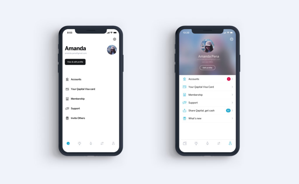 The upcoming iteration of your profile view is shown on the left with the current version to the right. There’s now a clearer emphasis on your actions.
- George Friedman, Co-founder & CEO
Put money in its place
Master your money with the app that makes it easy to divvy up every dollar so you can balance what you want with what you need.
Create account
Share